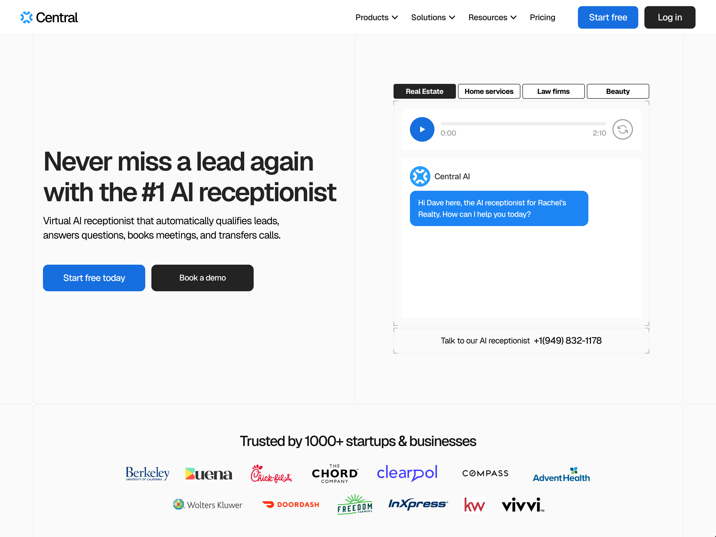
The team at Central approached me with a clear goal: they wanted a website that doesn't just talk about their product, but actually shows it. Central is a customer support platform that lets businesses manage conversations across WhatsApp, Instagram, Messenger, Shopify, and more, all from one place. It's a complex product with a lot of moving parts, and the challenge was making all of that feel simple and compelling on the web.
From the beginning, the idea was to create a site that feels alive. One that moves, responds, and brings the product to life as users scroll through. Not just a marketing site with pretty screenshots, but an experience that mirrors the energy and responsiveness of the product itself.
The scale
This wasn't a small project. The final site includes over 20 pages and more than 1,000 CMS items. That meant building a system, not just a website. Every page needed to feel cohesive, every CMS collection needed to be structured for the team to manage on their own, and the whole thing needed to perform well despite its size.
I designed and built everything in Framer, which gave us the flexibility to handle both the design complexity and the CMS architecture in one place. The CMS setup was one of the more involved parts of the project. With over 1,000 items spanning integrations, help articles, feature pages, and more, the information architecture had to be airtight. Each collection was structured so the Central team could add, update, and reorganize content without touching the design or breaking the layout.
Bringing the product to life
One of the first things we tackled was the product hero. Instead of using static screenshots that only tell part of the story, we designed a custom animation sequence that shows Central's chat agents tackling real tasks as new messages come in. Since one of Central's core strengths is handling conversations across many different platforms, we created a scene that shows all of that happening in real time. The animation plays out as the user scrolls, giving them a feel for the product before they've even clicked a button.
This set the tone for the rest of the site. Every major section got the same treatment: movement, interaction, and a sense of liveness that makes you want to keep scrolling.
Feature animations
From the hero, we moved into the features. Each key capability got its own short animation, roughly 10 to 15 seconds each. These weren't decorative. They were designed to explain the feature faster and more clearly than text alone could. A unified inbox showing messages from five platforms at once. An AI agent responding to a customer question in seconds. A routing system assigning conversations to the right team member automatically.
Each animation was built directly in Framer, which let us set custom scroll triggers and fine-tune the timing so nothing felt rushed or delayed. Everything stays responsive across screen sizes, from wide desktop monitors down to mobile. That last part took real effort. Scroll-driven animations that feel great on desktop can easily break on smaller screens, so every interaction had to be tested and adjusted for each breakpoint.
Designing for conversion
A website can look incredible and still not convert. From the start, we were intentional about every layout decision, CTA placement, and content hierarchy. The goal was to guide visitors from curiosity to action without ever feeling pushy.
We structured the pages so that each scroll reveals a clear value proposition, followed by proof (animations, customer logos, testimonials), followed by a natural next step. Nothing is hidden behind extra clicks. The information flows in the order a potential customer would naturally want to see it.
After launch, we set up conversion tracking to measure the results. The site achieved a conversion rate between 10 and 15 percent. For context, the industry average for SaaS websites sits around 1 to 2 percent. That's not just a design win. It's proof that thoughtful interaction design, clear messaging, and strong visual storytelling can drive real business outcomes.
Building a system, not just pages
With 20+ pages, consistency was everything. I built a component system within Framer that made it possible to maintain visual consistency across every page while still allowing each one to have its own character. Shared navigation, footer, CTA sections, and typography styles meant that adding new pages later wouldn't require starting from scratch.
The CMS collections were designed with the same mindset. The Central team can publish new integrations, update feature descriptions, or add help content without needing a designer or developer involved. That kind of independence was important to them, and it's something I always try to build into projects at this scale.
The result
The finished site feels interactive and alive. But more importantly, it works. It handles the complexity of a multi-feature SaaS product without overwhelming the visitor. It converts at a rate that surprised even us. And it gives the Central team a foundation they can build on for years.
This project pushed me to think bigger than I usually do. The scale, the animation work, the CMS architecture, the conversion strategy. It all had to come together. And I'm proud of what we built.